We’re going to start simple — with drawing — and learn to see details and attributes we might not have paid attention to before.
Habits of noticing and collecting great (and poor) examples of design, and being able to articulate and analyze them, will build your internal repository of design possibilities and expand what you can remix in your own mind without tools. These habits can be as simple as photos and notes. They’ll make you a better designer.
Norman, Emotional Design, 2004
Visceral
Your first reaction. Before you think. Color, shape, feel. “I want that.”
Behavioral
How well it works. Ease, effectiveness, satisfaction in use. “This just works.”
Reflective
What it means to you. Identity, story, pride. “This says something about who I am.”
“
Sketching is fundamental to ideation and design. Traditional disciplines such as industrial design, graphic design and architecture make extensive use of sketches to develop, explore, communicate and evaluate ideas.
— Tohidi, Buxton, Baecker, Sellen
User Sketches: A Quick, Inexpensive, and Effective Way to Elicit More Reflective User Feedback, NordiCHI’06
“
Many data visualization designers use old-fashioned sketching and drawing techniques on paper as their primary design tool: they sketch with data to understand what is in the numbers and how to organize those quantities in a visual way to gain meaning out of it.
— Giorgia Lupi
Information designer, partner at Pentagram. Co-creator of Dear Data.
Sketching with Data Opens the Mind’s Eye, 2016
Think more openly and creatively about your ideas
Create abundant ideas without fixating on quality
Invent and explore concepts visually — shapes, colors, marks that mean something specific to your data
Iterate quickly — rough-sketch on regular paper first, move to the handmade paper when something clicks
See patterns in your own taste that a list can’t show you
Archive ideas for later reflection — your WIP doc is your sketchbook
Week 1: Dear Data Drawing
Your ~20 favorite designs, tagged with SEMINAL. The drawing reveals what you gravitate toward — and what you overlook.
Weeks 2–10: Sketching as design tool
Journey maps, experience prototypes, system diagrams, rabbit hole documentation. Every week, you’ll sketch before you build. The hand discovers what the mind hasn’t formulated yet.
Choose ideas worth pursuing
Sketching lets you try many directions cheaply. Most won’t work. The ones that surprise you are the ones to develop.
When you draw your data by hand, you create from what you currently know. Then you read back what you drew — and see something you didn’t know was there. The drawing talks back to you.
A sketch is a simple designed product. You’re communicating through it — to yourself (what do I actually see in this data?) and to one another on Monday (can you read what I made?).
After Tohidi, Buxton, Baecker & Sellen, NordiCHI’06
You draw what you know. Reading it back shows you what you didn’t know you knew.
“
Images perceived as a set of signs.
Sender encodes information in signs.
Receiver decodes information from signs.
— Jacques Bertin
Sémiologie Graphique, 1967
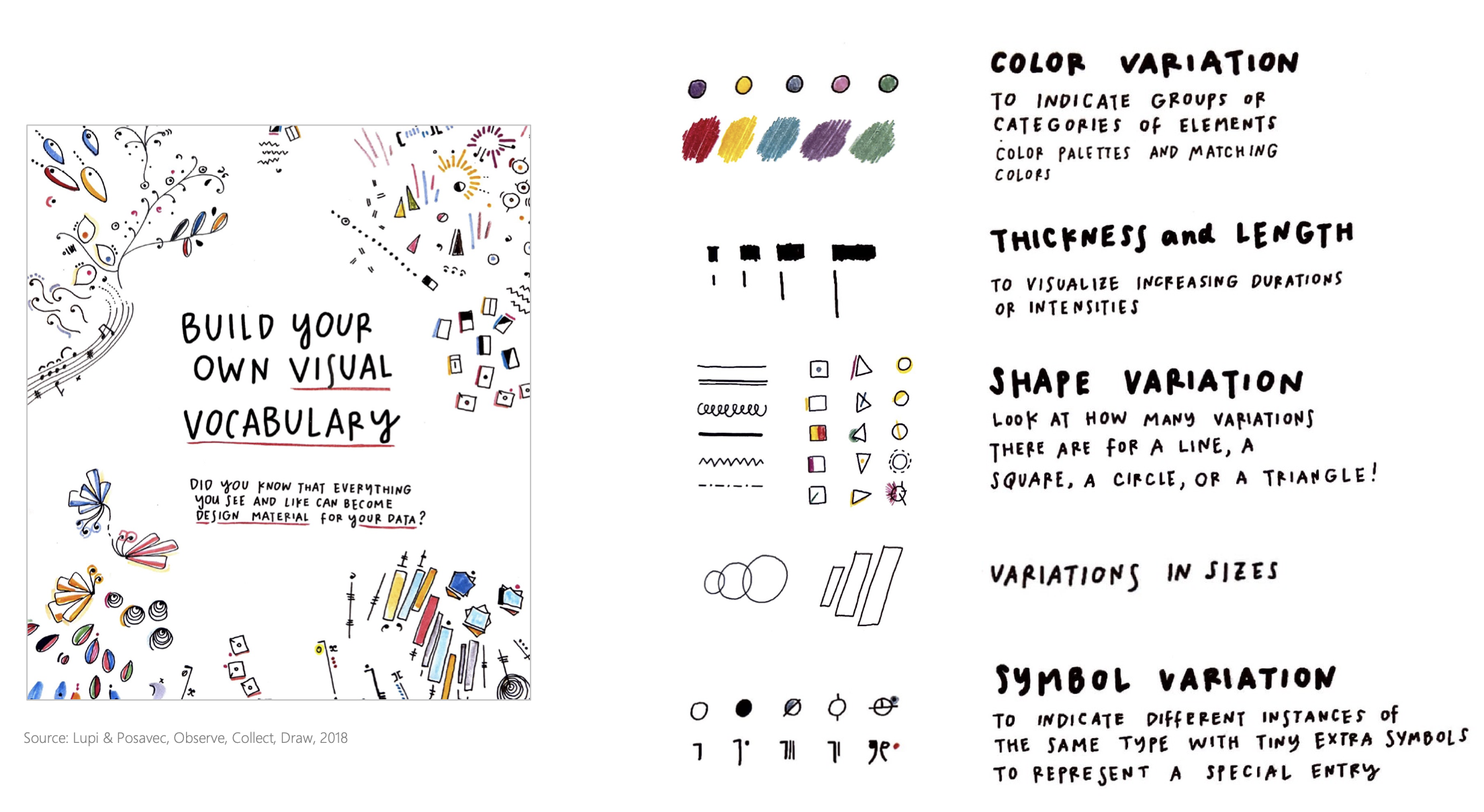
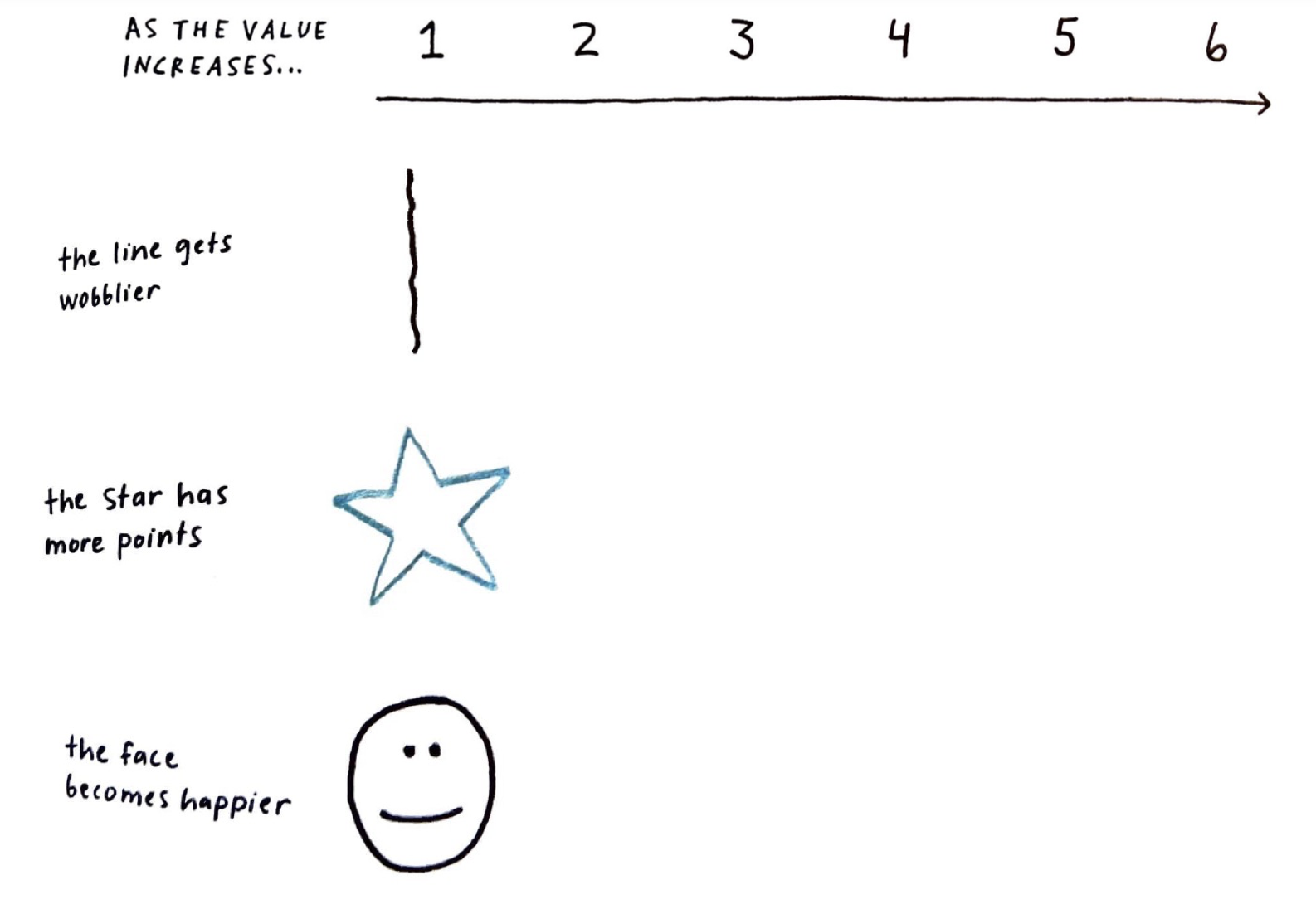
Every mark on your paper can vary in these ways. Each one can encode a different dimension of your data. These are your visual alphabet.
Position
Where on the page
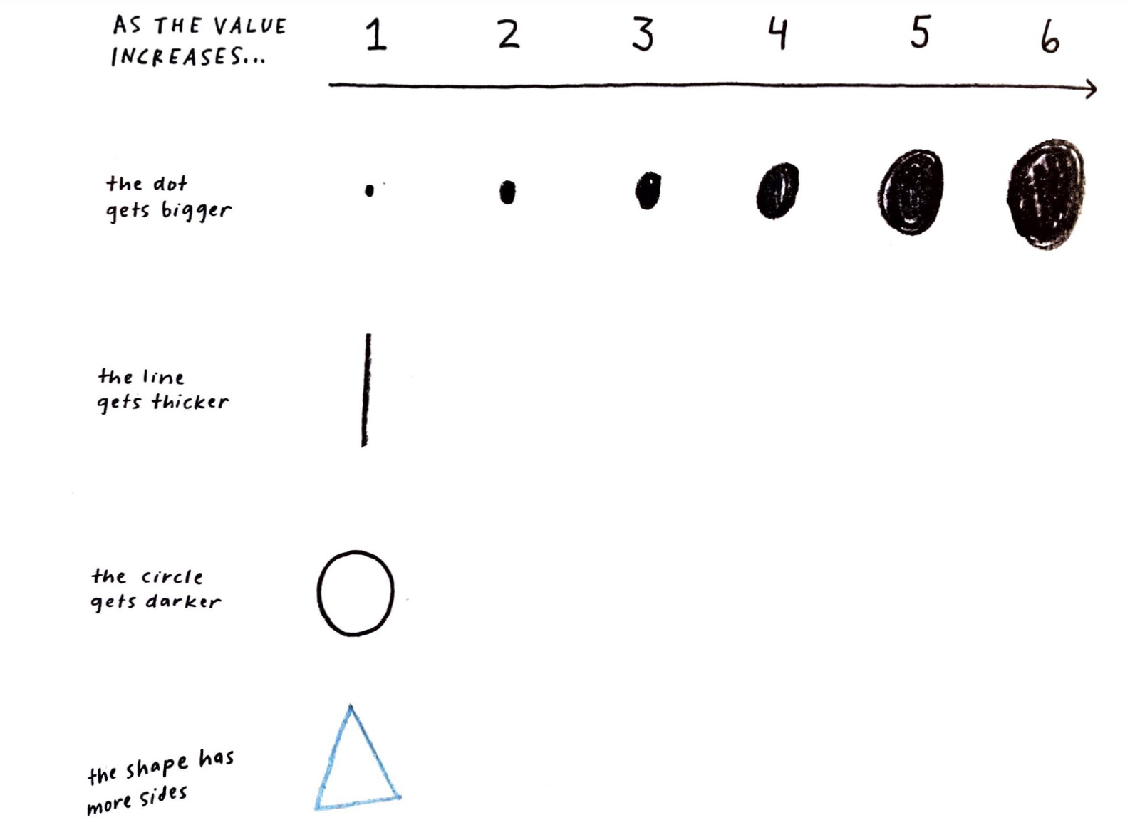
Size
Bigger = more
Shape
Category
Color (Hue)
Type, not quantity
Color (Value)
Light → dark = intensity
Orientation
Angle or direction
Texture
Fill, stripes, dots
Connection
Lines = relationship
Transparency
Faint → solid = emphasis
Enclosure
Boundary = grouping
Blur / Focus
Crisp vs. sketchy marks
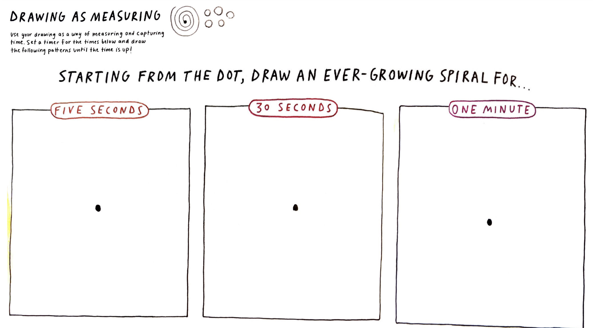
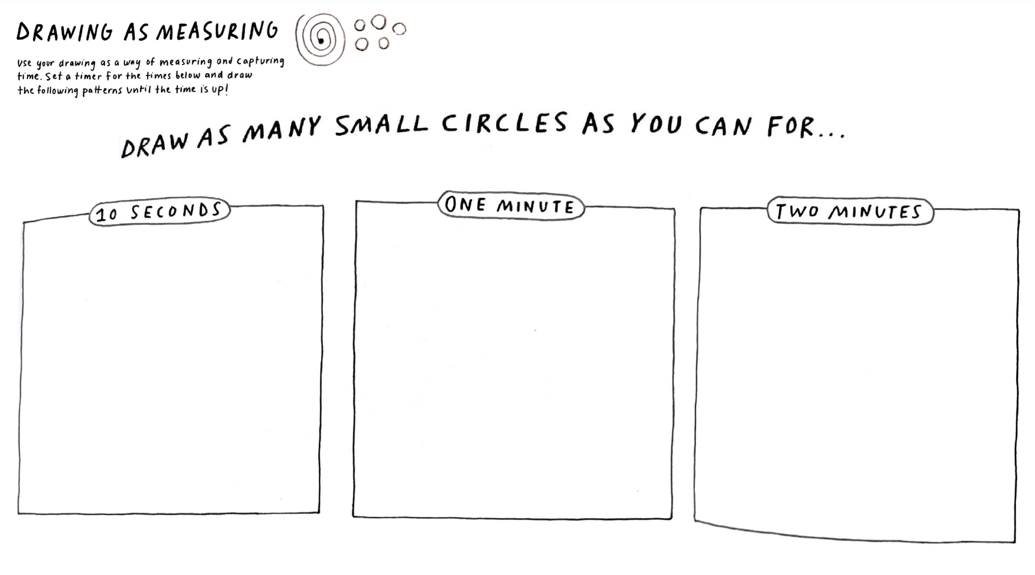
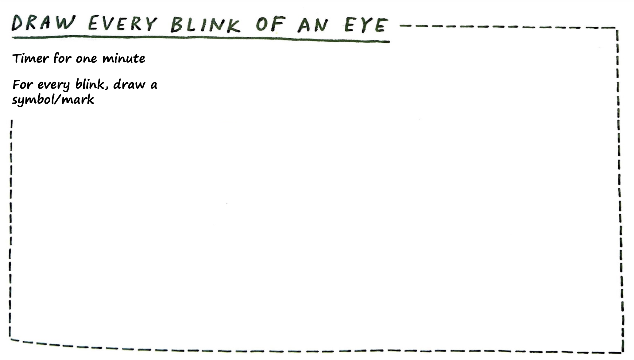
Use your drawing as a way of measuring and capturing time. Set a timer and draw the following patterns until the time is up.
Musical notation is a visual encoding system. Every symbol maps to a specific instruction: pitch, duration, volume, articulation. Composers encode. Musicians decode. The score is the designed product.
Quarter
1 beat
Half
2 beats
Whole
4 beats
Eighth
½ beat
Sixteenth
¼ beat
Half Rest
silence
Whole Rest
silence
pp
Pianissimo
very soft
f
Forte
loud
ff
Fortissimo
very loud
Staccato
short, detached
Tie / Slur
connected
♯
Sharp
raise pitch
♭
Flat
lower pitch
Crescendo
get louder
Fermata
hold longer
Shape = duration. Position on staff = pitch. Left to right = time. Symbols = how to play. A complete visual encoding system — designed centuries ago, still in use.
Imagine a student curated 6 designs and tagged them:
| # | Design | Systems |
|---|---|---|
| 1 | iPhone | M, A, S |
| 2 | Patagonia jacket | M, L, E |
| 3 | Noma restaurant | N, S, I |
| 4 | Central Park | N, E, S |
| 5 | ChatGPT | A, S |
| 6 | Repair Cafe | L, S, M |
Questions this student might ask: Which systems do I gravitate toward? Are there gaps? Do my favorites cluster or spread?
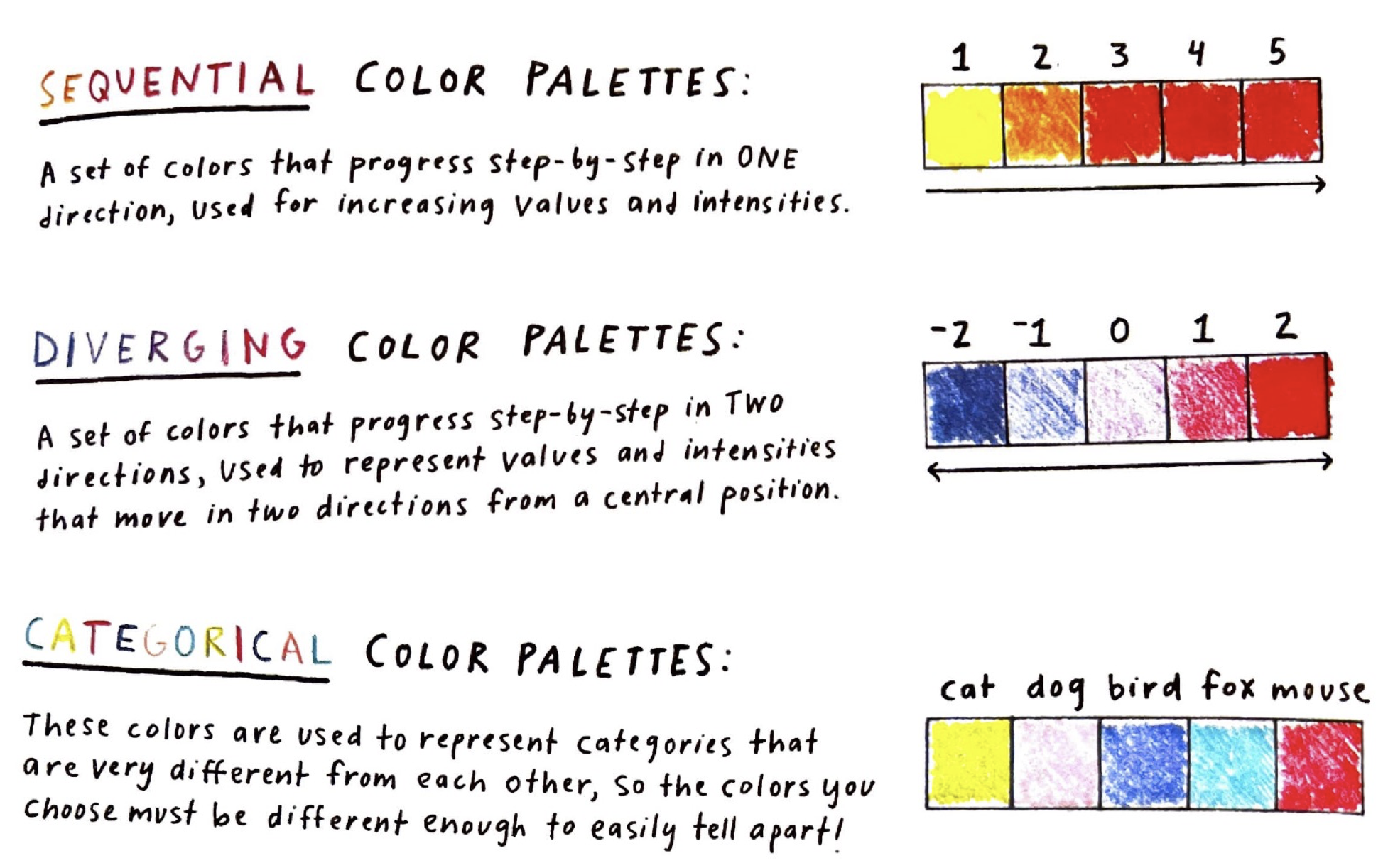
Color hue → SEMINAL system
S=red, E=green, M=blue, I=orange, N=brown, A=purple, L=gold
Shape → how many systems it touches
2 systems = circle, 3+ systems = star or flower
Position → when you first encountered it
Left = childhood, right = recent. Timeline of your taste.
Size → how much it matters to you
Big = life-changing, small = I admire it from a distance.
The legend explains your choices.
Without a legend, a data drawing is just a drawing. The legend is what makes it readable — by you later and by anyone else.
Your legend is the key that makes your visual choices readable. It should explain:
What each shape means
“Circle = 2 systems, star = 3+”
What each color means
“Red = Service, Blue = Material”
What position encodes
“Left = childhood, right = now”
What size encodes
“Bigger = matters more to me”
Look at the Dear Data postcards — every single one has a legend on the back. That’s not optional. It’s the design.
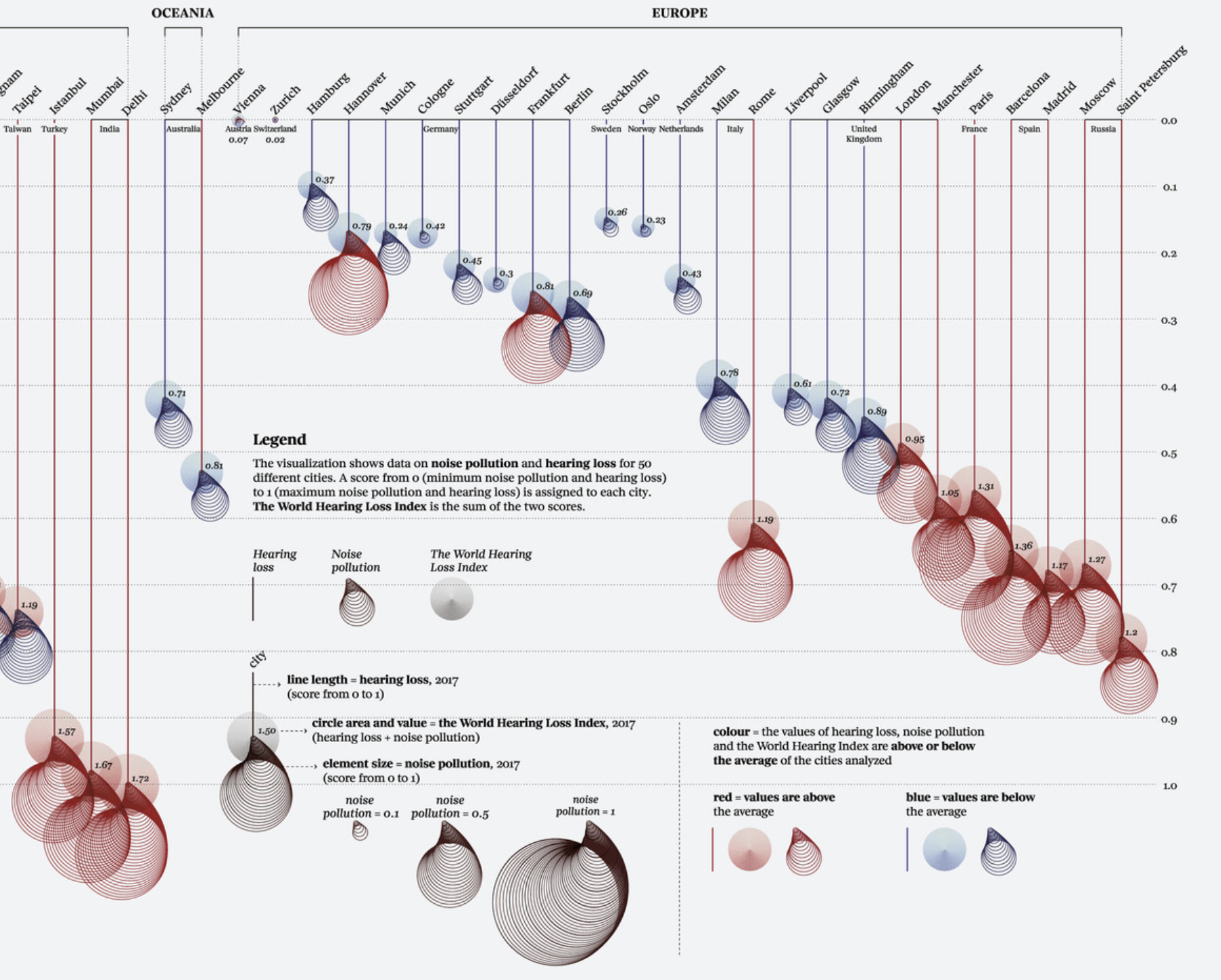
Federica Fragapane, Noise Pollution, 2020. Data visualization for La Lettura. In the collection of MoMA ↗
1. Look at your data table — your ~20 designs with SEMINAL tags.
2. Choose your visual variables. What will shape, color, size, and position each encode? Write these down first — this is your legend.
3. Rough-sketch on regular paper first. Experiment. Try different assignments. What reveals something interesting?
4. When you find a combination that surprises you, move to the handmade paper.
The goal is not a beautiful drawing. It is a legible one that inspires a conversation you can learn from.
The goal is a drawing that shows you something about your taste that you didn’t see in the table. Beauty comes from the clarity of the system you invent.